

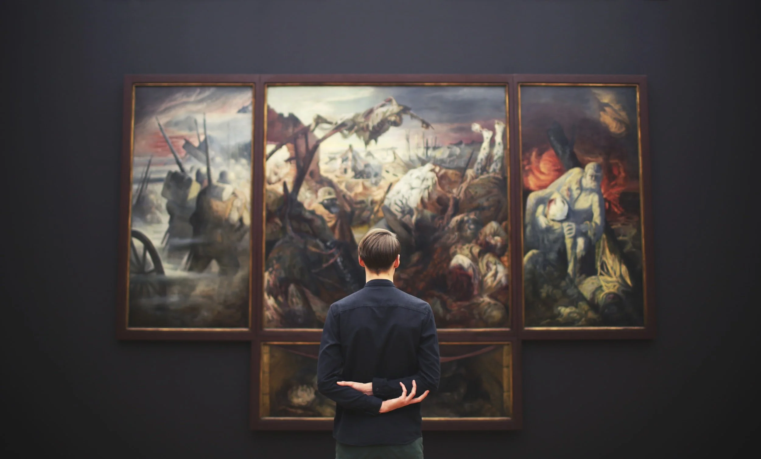
GalleryPal: Tap into your inner art critic and collector with one simple app.
Day 1:
Understand & Map

Understanding the Users
After going through the research, persona, and interviews with museum-goers and museum experts provided by BitesizeUX, my main takeaways were:
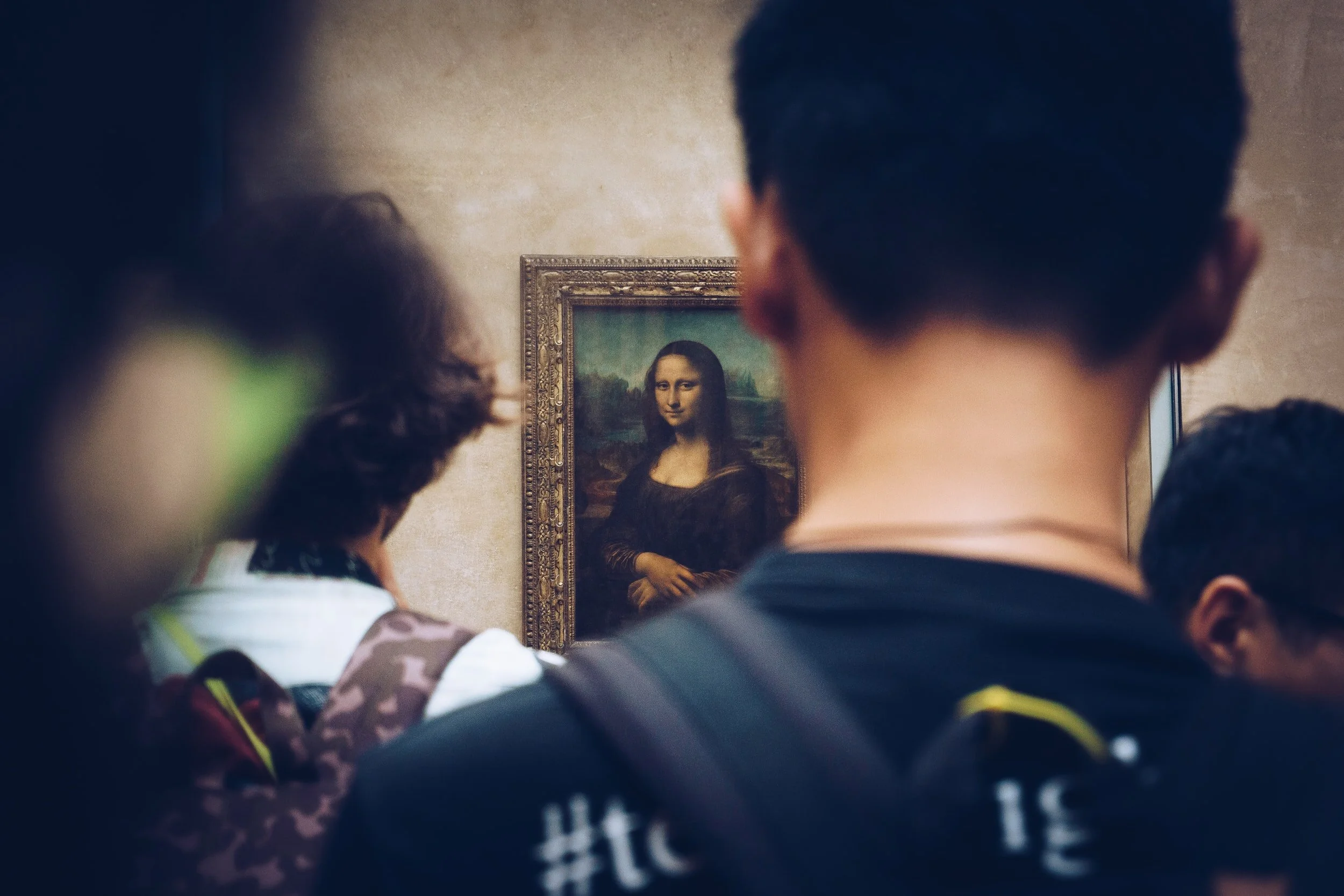
Museum goers have generally done no prior research on the art
Museum goers want to know a bite-size amount about the art they are viewing; they are easily overwhelmed or turned off by long articles
Museum goers would like a little bit of into on the artist’s background and perspective, the technique used, and a quick analysis of the artwork itself
Art experts and museum staff want their guests to receive enough information on the artist, the piece, and the technique for the guests to form their own thoughts, feelings, and opinions on the art
Given these insights, I came up with How Might We Statements to inform my design
1
How might we provide an accessible and easily digestible learning experience for museum goers?
2
How might we encourage users to form personal thoughts, feelings, and opinions on the art they see?
3
How might we make the whole experience quick and easy to complete while inside of a museum or gallery?
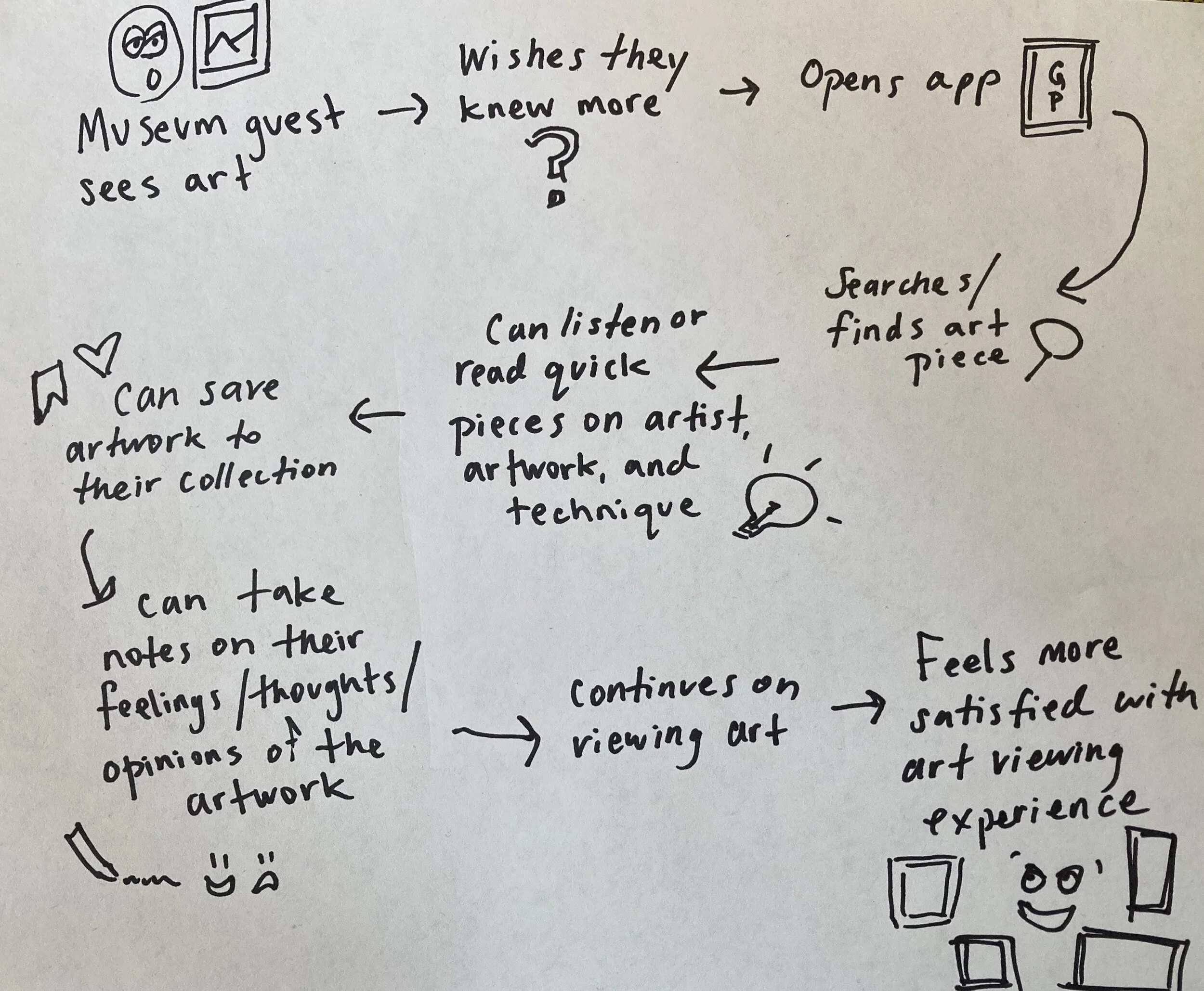
Mapping a Solution
Museum guest sees art
Wants to know more
Opens App
Searches/finds art piece
Can listen to or read quick pieces on artist’s background, inspiration, techniques/mediums, historical context & similar works
Can save the art to their favorites and/or take notes on thoughts/feelings about piece
Can continue on with their viewing
Feels more satisfied with gallery experience

Day 2
Sketching

Modified Lightning Demos
Day two started with a scroll through apps that I thought might lend features to GalleryPal.
Shazam (left) makes the process of finding a song as quick and easy as possible, with a giant button that you cannot miss. How could we translate this to quickly finding artwork?
Amazon (middle) uses image scanning in its app, which is an easy and quick way to find things that does not involve typing.
Zillow (right) does a great job of showing the image, while highlighting the info with a pull-up tab taking up more of the screen. They also include save and share icons overlaid on the image in the top right.

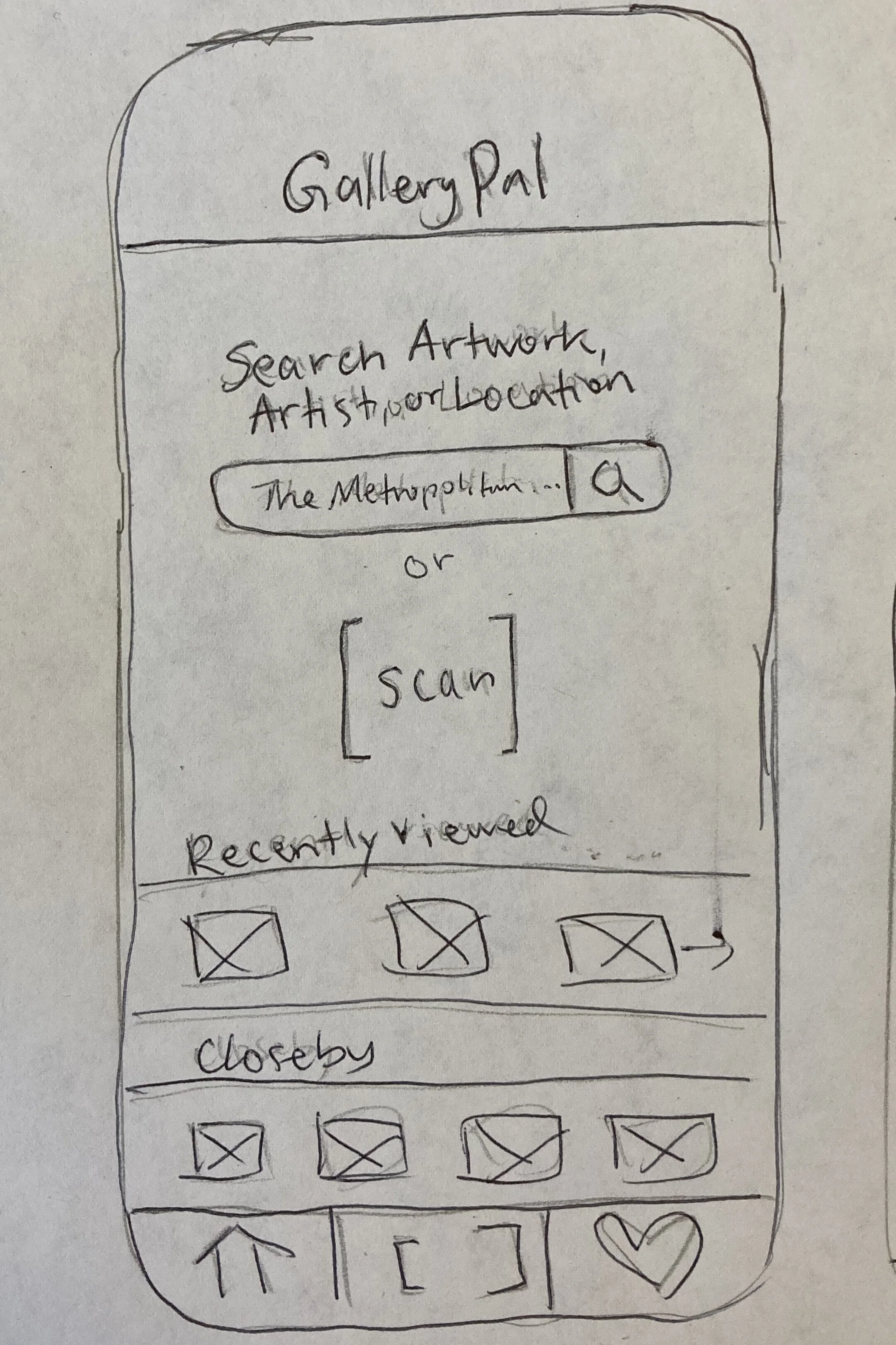
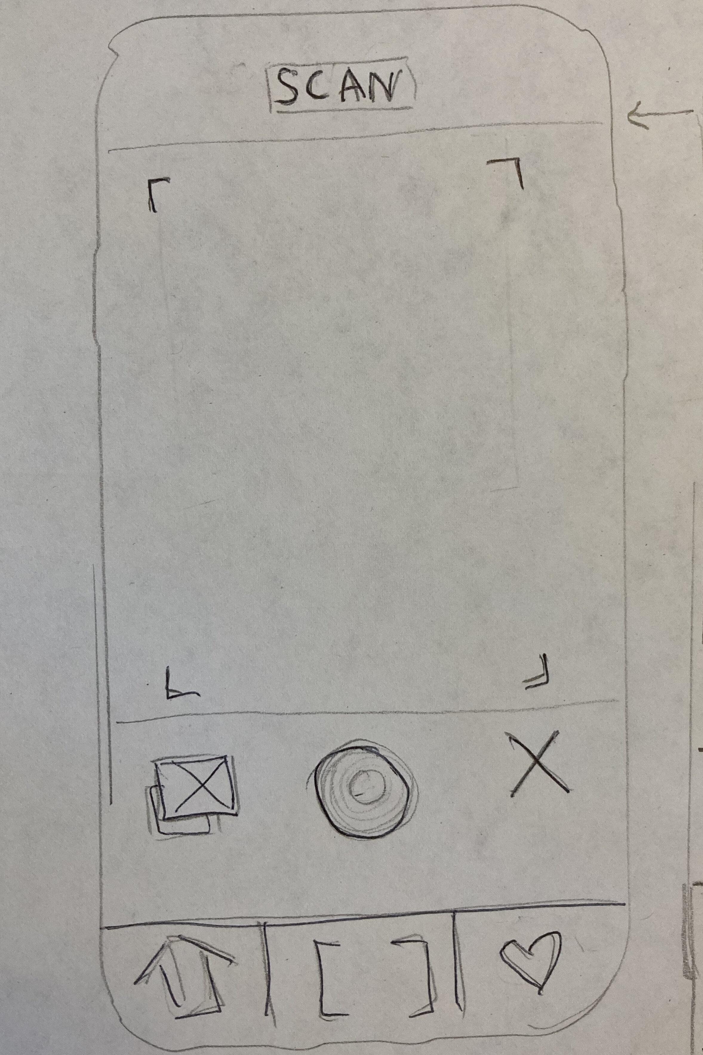
Sketching Ideas
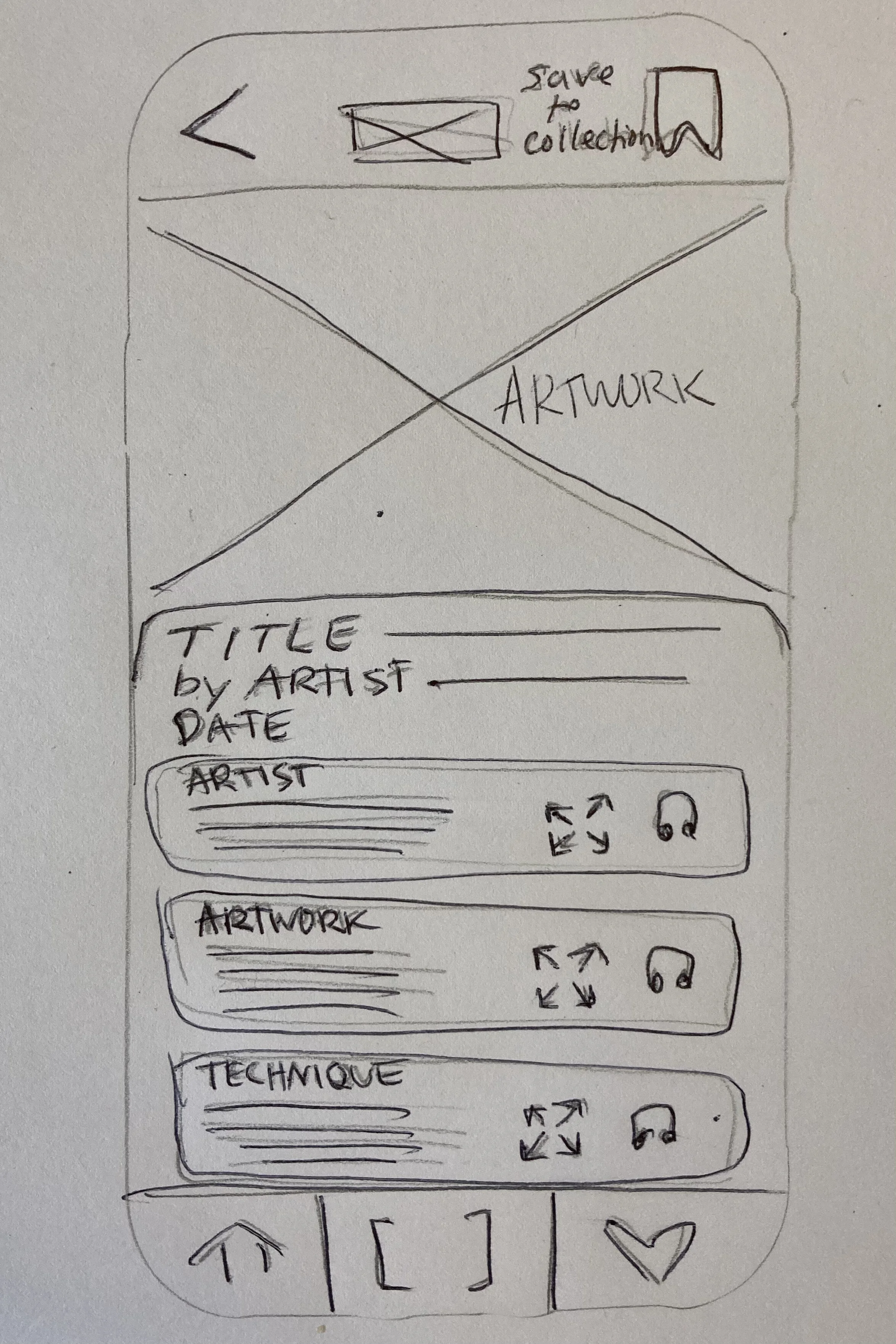
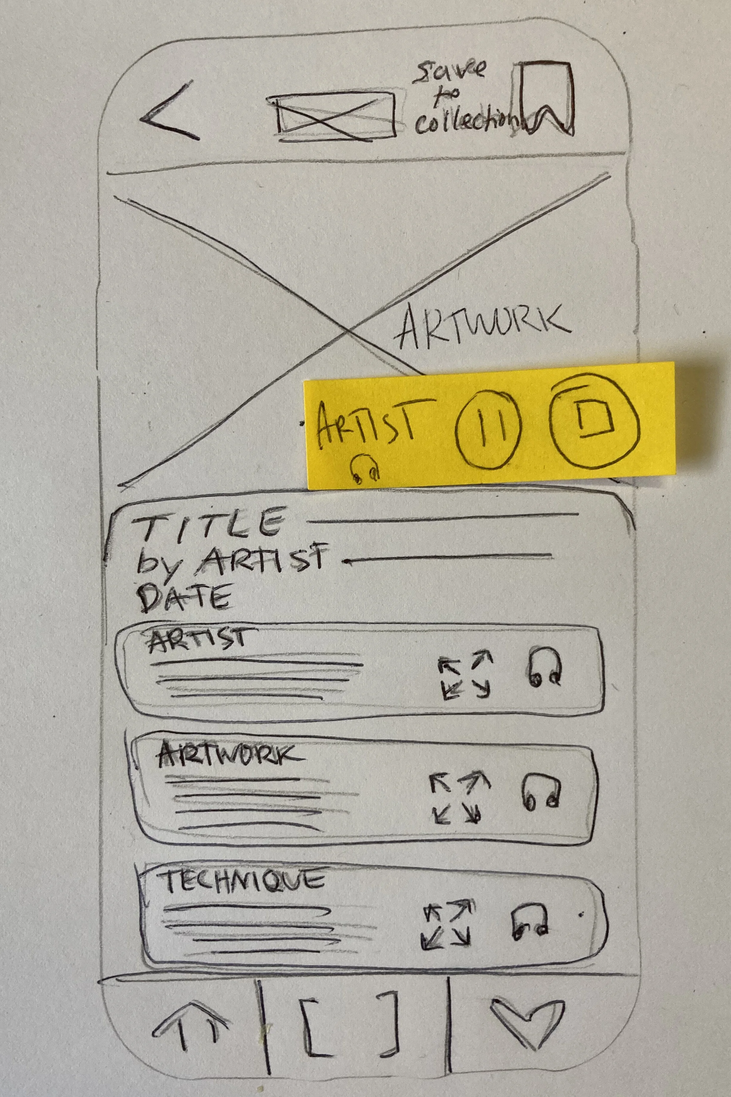
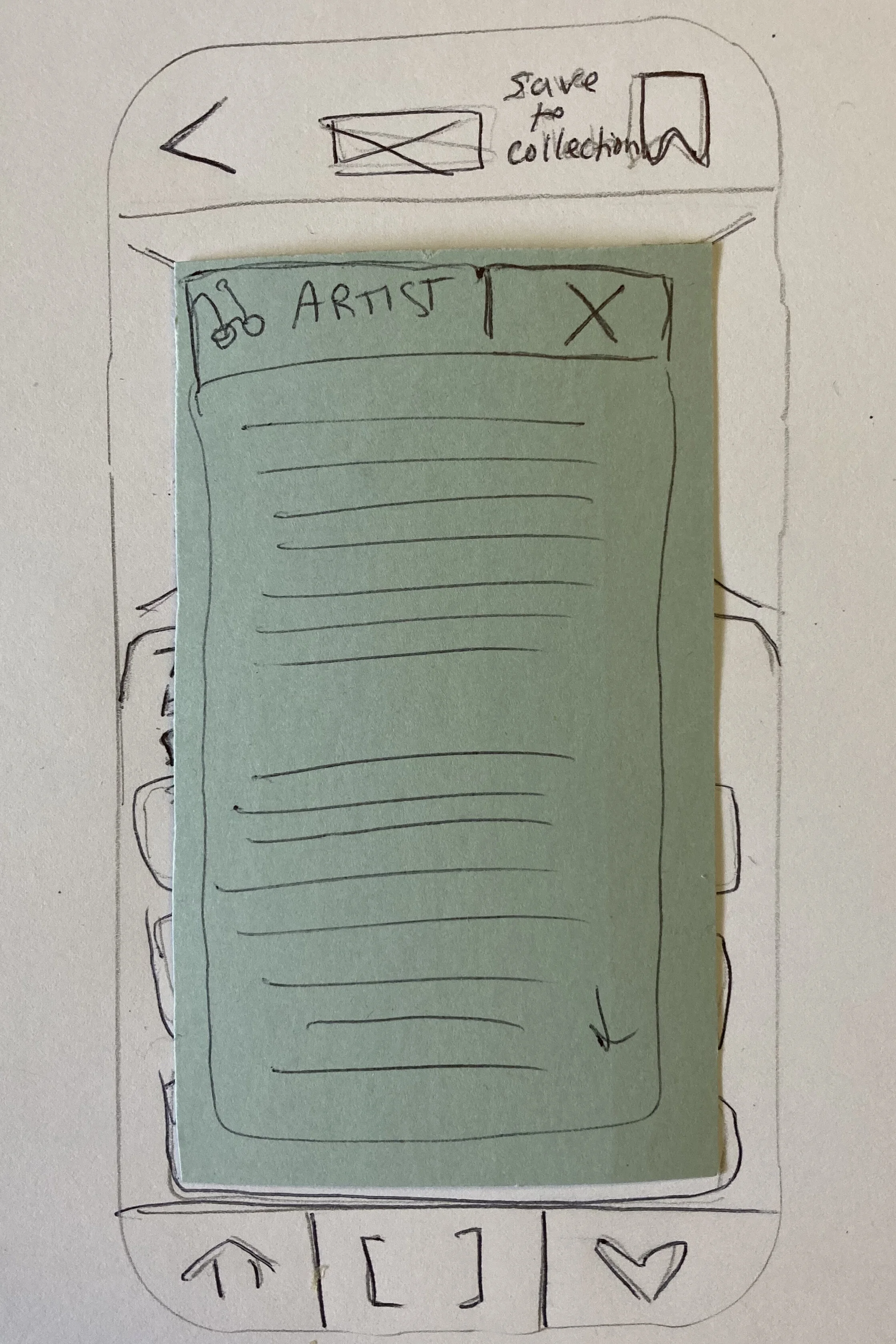
After completing the Lighting Demos, I started ideating one of the most important screens: the artwork learning screen. I used the Crazy-8’s exercise by setting a timer for 8 minutes and creating 8 quick sketches of possible solutions for that screen.
Of all the options in the exercise, I chose the one that I felt gave users the most relevant info in the easiest to consume format. Inspired by Zillow, it shows the artwork but focuses on the info, with cards that give users the option to listen or read more about the artist, work, and technique.
With that solution in mind, I created a solutions sketch for the two screens that come before and after the learning screen.

Day 3
Storyboard
Next it was time to create solutions for the whole story. Working backwards and forwards from the three sketches I created yesterday, I sketched a solution that attempts to make the process of finding, learning, and saving art, as simple as possible.
You’ll notice in the last image below, I updated the navigation bar to include an icon that better represents a user’s diverse collection of art and opinions.
1 Home
2 Scan
3 Learn
3.1 Listen
3.2 Read
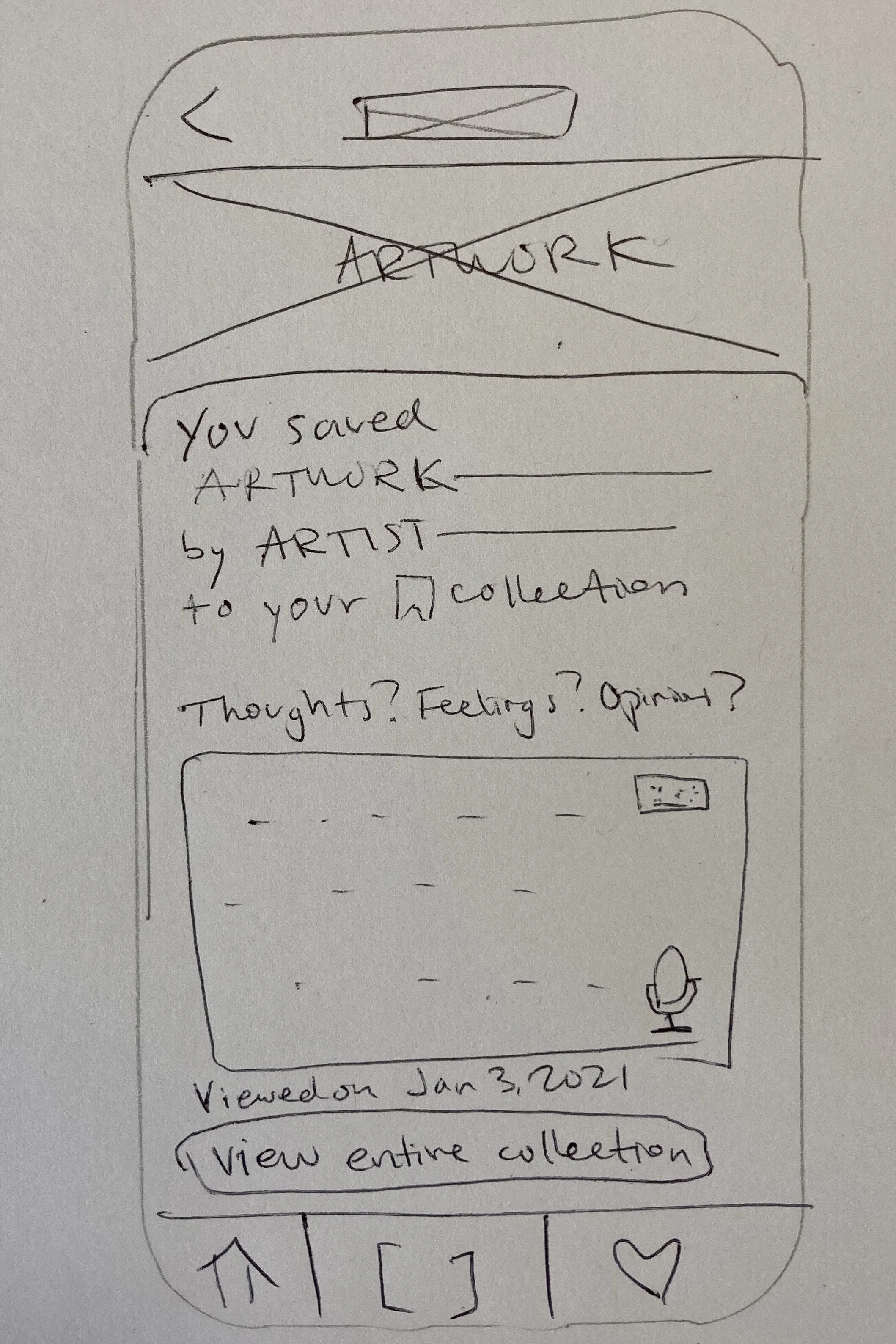
4 Save / Notes
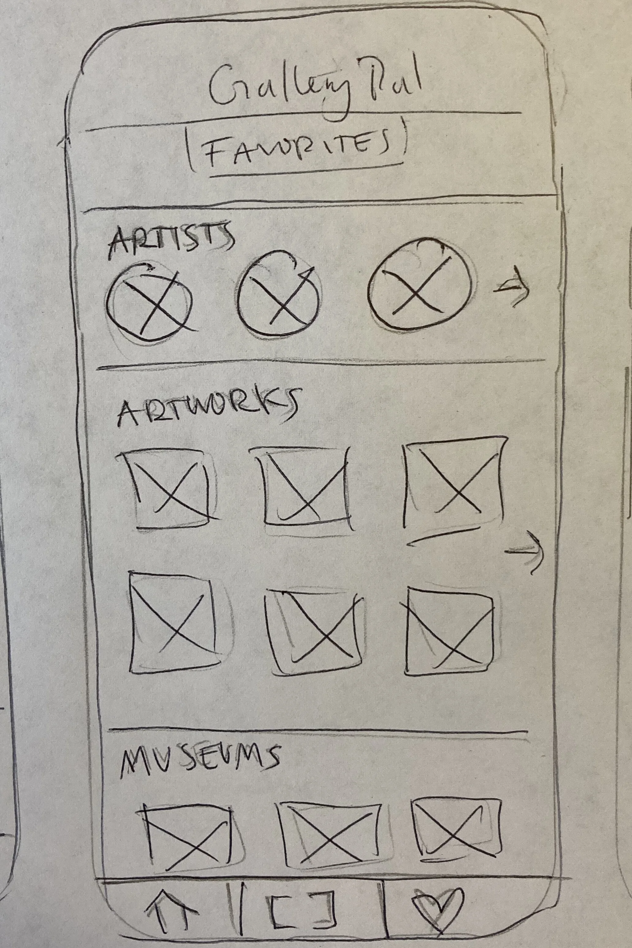
5 Collection

Bottom Nav Update to let users form opinions other than Love
Day 4
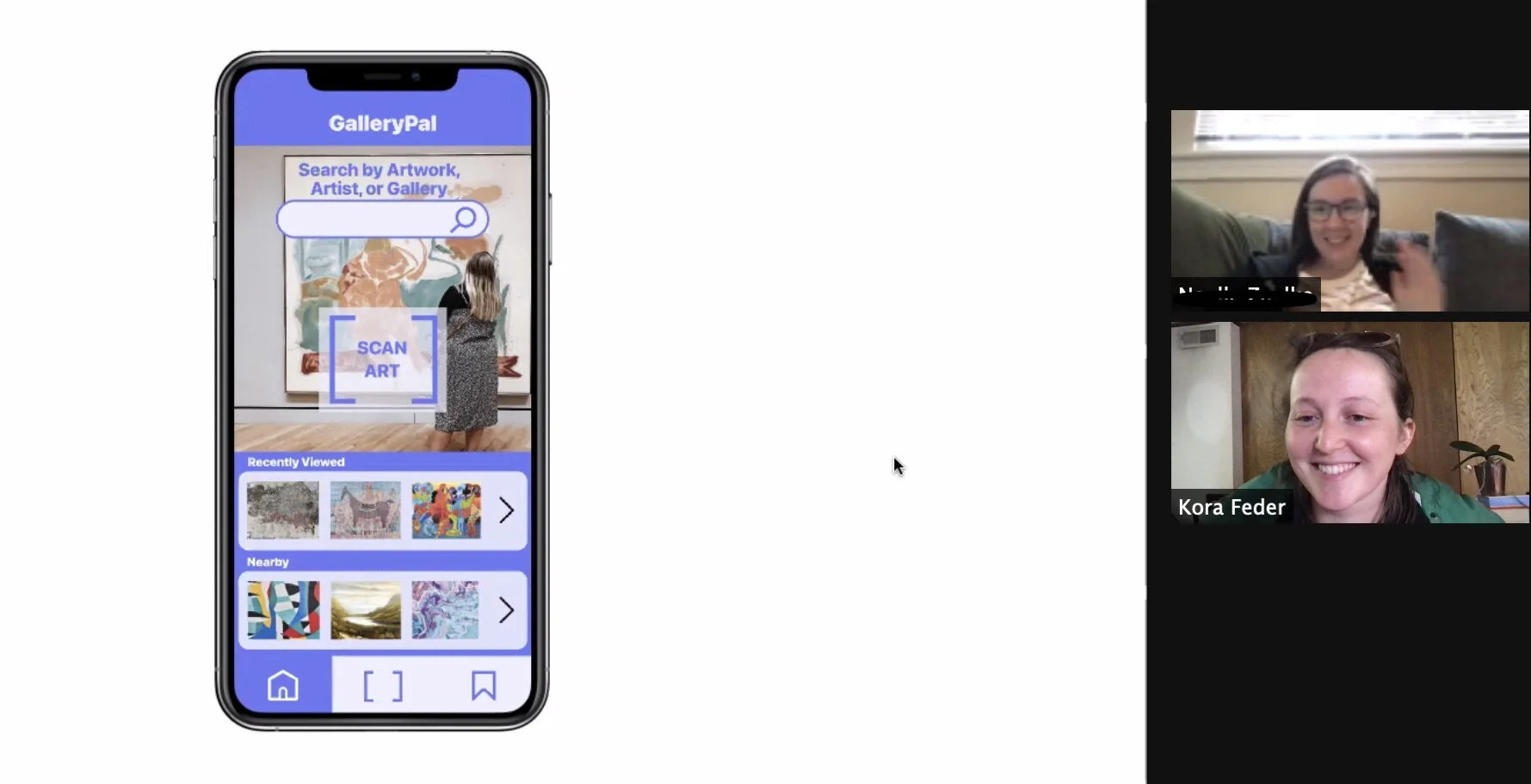
Prototype

Watch the prototype in action
Press play to watch a user move through the app.

Day 5
Test
5 Tests of the Prototype on Museum-Goers
I tested the prototype on 5 users. Two consider themselves avid museum goers (museum visits about once a month before Covid-19), and the rest said they would normally visit a museum or art gallery between 3 and 5 times a year. They were between the ages of 20 and 60, and all said they carry a smartphone around with them daily.
Feedback was overall positive, with all of the users expressing that GalleryPal would be a valuable addition to their life. Three of them (including the avid museum-goers), expressed that they especially loved the idea of saving their personal thoughts on specific artwork and being able to go back and check out their collection.
All of the users moved through the app as expected, implying that the icons and buttons are intuitive.
Two users expressed that they wished there were opportunities to share artwork and their collection on their social media or by email. Other feedback included a desire for music to go with each piece, video options, and an interest in notifications about current exhibitions that relate to their collection.
Recommendations
After watching users move through the app and listening to their thought process and feedback, I would recommend the following updates:
Remove or change the ‘View My Collection’ button on the Save/Notes screen. This is slightly redundant and confusing, since the bottom right navigation button does the same thing.
Add sharing options. (This was in the sketches, but in the haste of rapid prototyping, I forgot to add into the prototype)
Consider updating the ‘expand’ icon on the Learn page. It worked fine, but consider reading glasses or something a little more conducive to reading.
Add a function for some permanent galleries where users can click some sort of ‘next’ button or map to move throughout the gallery without scanning each time.
Reflections
This experience was very fun for me, as I like projects that require rapid action and change. I ended up doing a few of the “days” in one day, because I got going and could not stop!
It was useful for me to have a deadline, even if my own, set out for each task. I often work well under a time crunch, as it forces me to let go of perfectionism and instead focus on producing good (but not necessarily perfect) content.
I look forward to working with teams in the agile setting, as I think the biggest thing missing in this project was other designers’ perspectives and ideas.