

LOC Coin: The Merchant side of a new kind of rewards marketplace.
Overview
LOC Coin is a South African based fintech company that’s creating a marketplace where South Africans can find, use, consolidate, and share their rewards points from hundreds of thousands of merchants. Their product will eventually transfer unused rewards points into a cryptocurrency called LOC Coin.
My team was tasked with designing personas, user flows, wireframes, and a few high fidelity screens for the the mobile and desktop versions of both the consumer and merchant sides of the new company. I worked on research and flows for both the consumer and merchant sides, and then took the lead on the merchant wireframes while my colleagues focused on the consumer. This case study will talk about both sides but focus on the merchant experience.
Merchant Solution
Businesses can grow their customer base through LOC Coin’s marketplace, learn more about their customers and rewards through in-depth analytics, and join a community of fellow merchants to keep up with news, tips, and tricks of running a rewards program.
Team
UX Designers: Kora Feder, Tessa Veto, Bre Walker
Founder & CEO: Tshibangu Kalambaie
Tools
Figma, FigJam (Beta)
Timeline
April - June, 2021

Before we Jump In: The Consumer Side for Context
Here are the most important Consumer side mobile screens and their basic functions. Although I did not create these wireframes, I was deeply involved in the research and information architecture that got us to this point.

Okay, now back to the beginning…

Main Sources:
5th edition of the Truth & BrandMapp South African Loyalty Landscape Whitepaper
SA Fintech In Motion Report, 2019
Step 1: Secondary Research
We combed through about 8 articles and white papers on how South Africans use rewards programs. Here are some of the insights we gathered, and how they informed our UX decisions.
73% of South African consumers still prefer the use of a physical loyalty card. Many leading loyalty programs still offer more than one loyalty identifier (card, App, and cell number). So, the consumer experience of using the app needs to be as seamless and easy as swiping a card.
When asked what frustrates them about rewards programs, almost 40% of people noted the lack of rewards relevant to them. This is a sign that personalization will be important for user experience and retention. This will impact the merchant side as well, where rewards need to be able to be personalized.
Many frustrations came up about getting too many texts and emails from rewards programs, complicated redeeming processes, and frustratingly long registration processes. This adds to the need for a frictionless, easy experience that replaces all texts and emails with one app. Merchant side needs to focus on less spam, and fewer rewards per merchant.
Step 2: Competitor Analysis
After reviewing many merchant or business side experiences such as Yelp, Groupon, and Etsy, we came up with a few things we thought we should carry into our design phase:
Simple bottom navigation, similar to Etsy Sell.
Analytics organized in cards, similar to Groupon Merchant.
Interface needs to be insightful and useful while not overwhelming users, especially small business owners who may not have marketing/data experience.
App needs to include: Team Control, Analytical data on rewards and members, Profile or Business Info, Easy Photo Upload, Easy Cancel/Change Reward.


Step 3: User Interview & Personas
Based on interviews and data collected by LOC Coin before I came on to the project, and data from our secondary research, we came up with two simple guiding personas for our merchants. One, a Small Business Owner who is looking to grow their business and learn about the rewards world. The second, a Rewards Manager at a larger chain store, looking to utilize LOC Coin’s marketplace.
Step 4: App Map
In order to make sure that we were on the same page as the founder in terms of how the Consumer and Merchant products actually work, I suggested we create rough app maps. We did so for both consumer and merchant sides and used them as talking points in our meeting with the founder.
Left: Early Merchant App Map, to make sure the LOC Coin Founder agreed with the early navigation decisions.
Step 5: MVPs, Tasks, & User Flows
Next, I started putting together a more in-depth user flow that considered the four main MVP’s for our merchants.
Create an account in order to offer and control rewards for members.
Add and change information about business, rewards, and surveys.
Understand consumer patterns with an analytics dashboard.
Be in the know on LOC Coin merchant news, from merchant stories to consumer trends.
Step 6: Sketching/Ideation
Before taking to Figma, I like to draw out my main screens in a few different ways to see how they feel, and get a sense of where I’m headed before going digital.
Icon brainstorming for the three menu icons: Analytics, Profile, News

Those three main screens: Analytics, Profile, News

Step 7: Mobile Wireframes & Notes on Future Iterations
I started with mobile because I knew it would be more challenging to fit all of the needs and controls into such a small screen. Using the template we had created for the Consumer screens, I built out all of the Merchant screens. These also include some notes on future iterations that I passed on to the LOC Coin founder.
Onboarding

Main Menu / Primary Screens
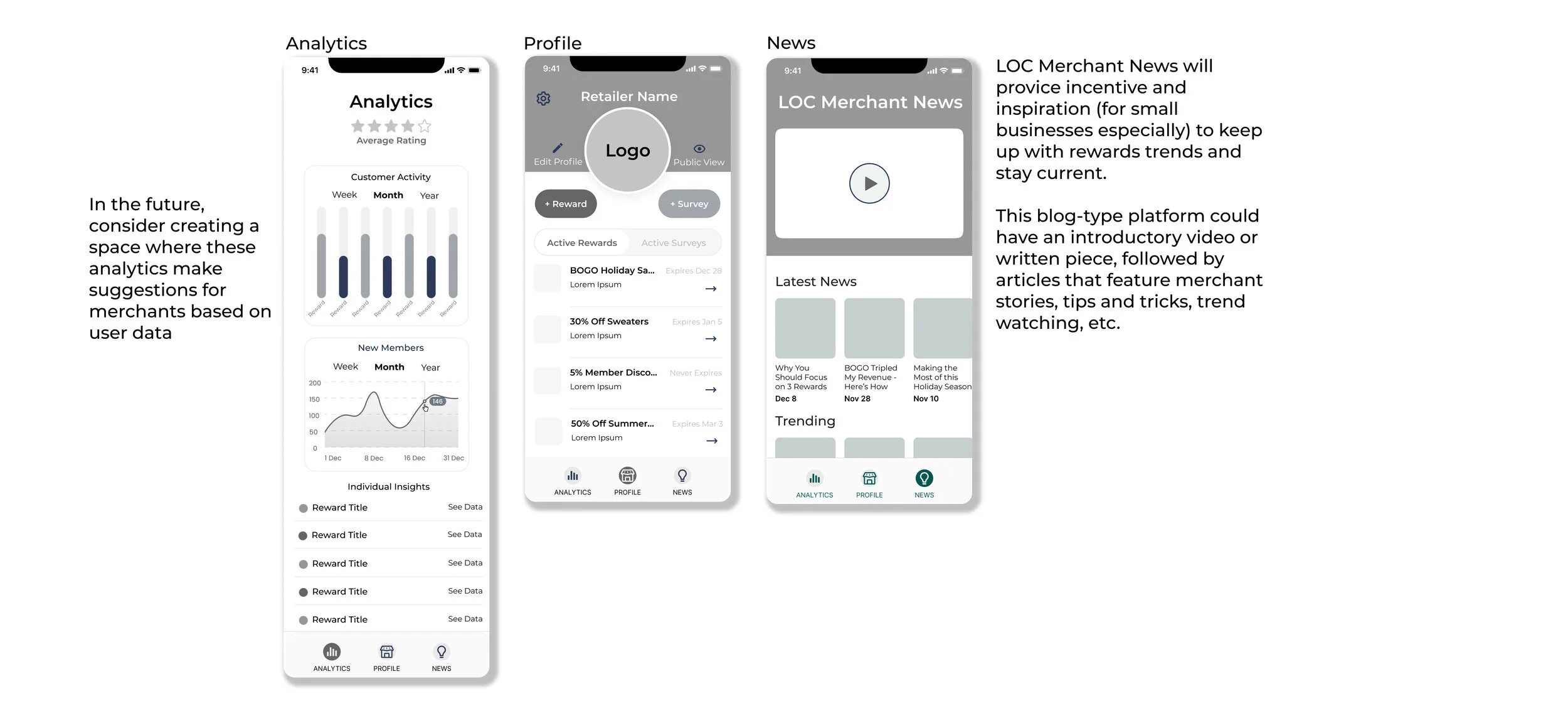
Profile Secondary

Settings

Step 8: Desktop Wireframes
As I transferred the mobile experience to desktop, I consolidated all of the mobile options and pages into a few larger dashboards that contain multiple mobile screens and a few additional features and options. The desktop version has a landing page for merchants who aren’t logged in or haven’t created an account. It also includes a place for merchants to submit their stories or ideas to the News page.
Onboarding

Main Screens

Profile Control Screens

Settings

Step 9: High Fidelity Suggestions
Although high fidelity screens were not part of the scope or plan, we did decide to add some of the pre-existing brand colors to a couple screens. This gave the Founder a clearer view of the future of the product, and could be used as a guide for developers or future designers on this project.

Step 10: Reflections & Recommendations
I’m so glad I got the opportunity to work on this team and project. Running ideas off of Bre and Tessa made the experience more valuable, and the end product well rounded. We all took charge of different aspects of this project, but gave and took feedback in positive and collaborative ways. Our client, Tshibangu, was also a pleasure to work with. His enthusiasm and honest, insightful feedback was appreciated, and he was always open to our perspectives. His team is pleased with the end product and has asked us to come back on when LOC Coin is fully funded.